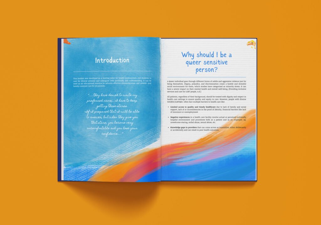
This booklet was developed as a starting point to help health profession care for diverse patients with sensitivity and understanding. It can be us as an educational resource to advance effective communication and patient- and family-centered care for all patients.

Why should I be a queer sensitive person?
A Queer individual goes through different forms of subtle and aggressiv violence just for being themselves. Stigma, prejudice, and discrimination create a hostile and stressful social environment for them, which studies have categorized as minority stress. It can have a severe impact on their mental health and overall well-being.
All patients, regardless of their background, should be treated with dignity and respect in health care settings to ensure quality and equity in care. However, queer people often face multiple barriers to health care like:
Limited access to quality and timely healthcare due to lack of family and social support, lack of or inconsistencies in the proof of identity, financial barriers like lack of insurance or unemployment
Negative experiences in a health facility involve actual or perceived unfriendly hospital environment and procedures both as a patient and as an employee. eg: unwelcome staring, verbal abuse, sexual abuse, etc.
Knowledge gaps in providers that can come across as insensitive, either deliberately or accidentally and can result in poor health outcomes.


The conception of this booklet’s design finds its roots in the intricate realm of color theory, endeavoring to encapsulate the full spectrum of colors that each unique individual embodies. Each page within this booklet has been meticulously tailored to encapsulate distinct concepts, such as contrast and harmony, which in turn serve as poignant metaphors for the tapestry of interpersonal relationships.
The design approach for this booklet further extends to the realm of artistic expression, employing fluid and painterly patterns that gracefully navigate away from rigid structures. This choice imbues the design with a sense of organic flow, mirroring the ever-evolving nature of human connections and emotions.
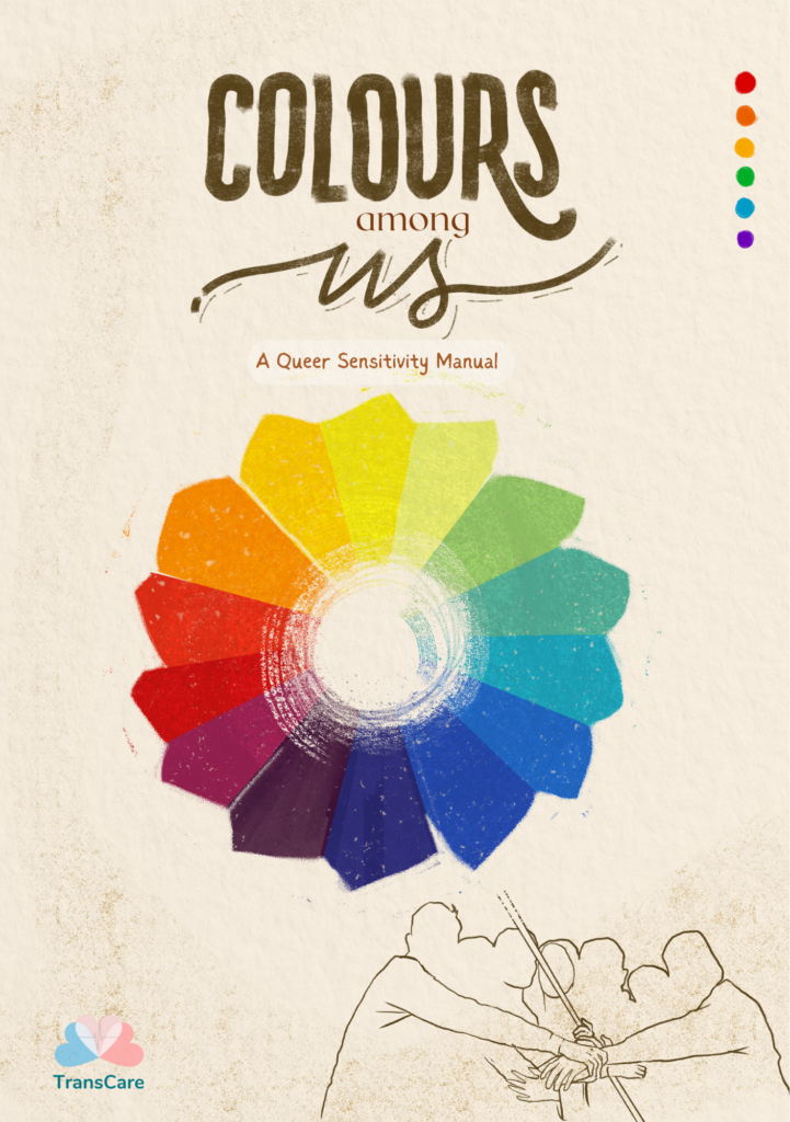
Yet, at the heart of this design, you will discover the cover, a vibrant and dynamic color wheel. This wheel stands as a powerful emblem, masterfully illustrating the diverse and tightly interconnected community that each and every individual supports, empowers, and deeply values. It not only encapsulates the essence of unity but also reverberates with the collective appreciation for the rich tapestry of individuals that comprise this community. This color wheel, with its array of hues and shades, serves as an eloquent visual metaphor for the harmonious coexistence and collaboration among the community members, beautifully mirroring the myriad hues that make up the grand mosaic of human relationships.